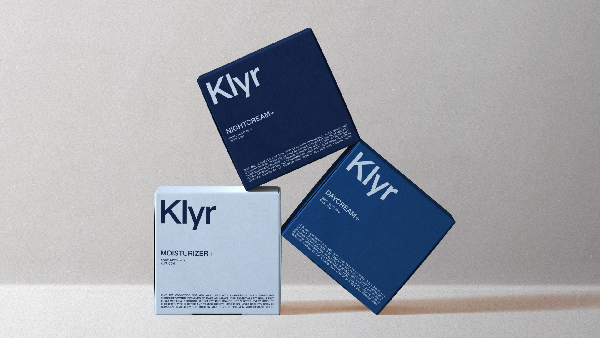
Klyr
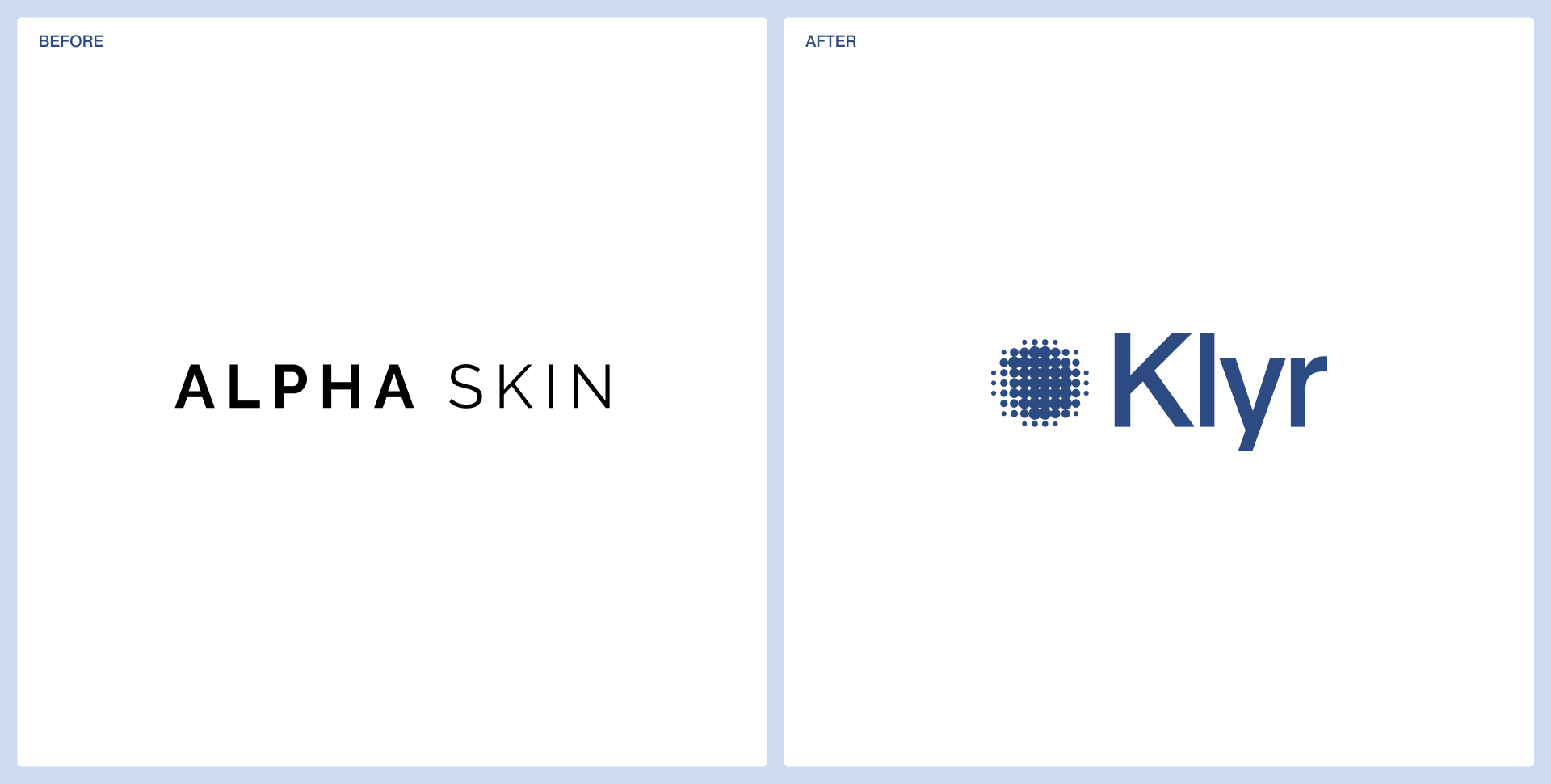
From Alpha Skin to Klyr, to a 50% jump in conversion.
After launch, orders came in immediately, including a single order worth €190, and the webshop's conversion rate rose 50%. The rename and rebrand repositioned the product from a generic men's cosmetic into a refined self-care essential.
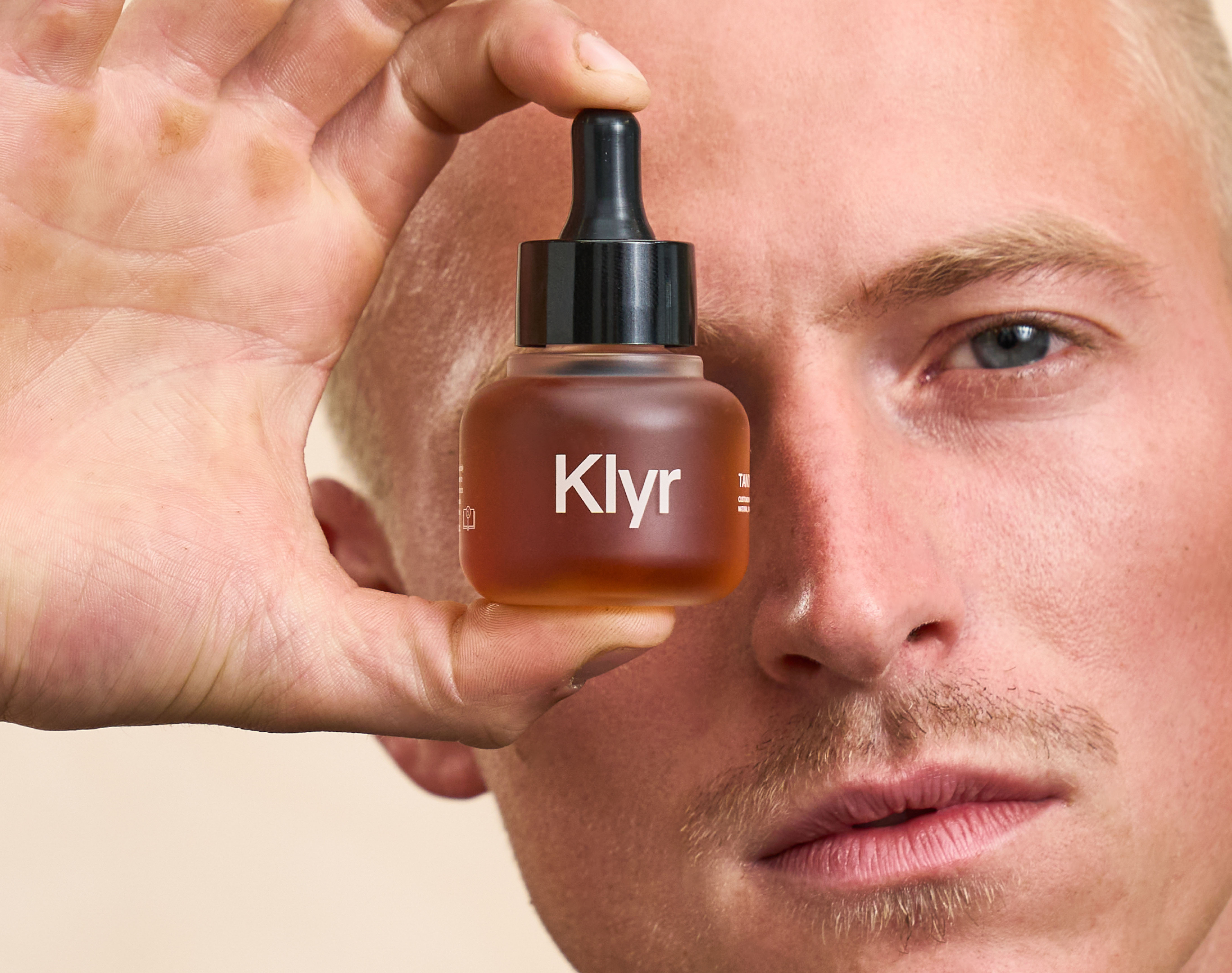
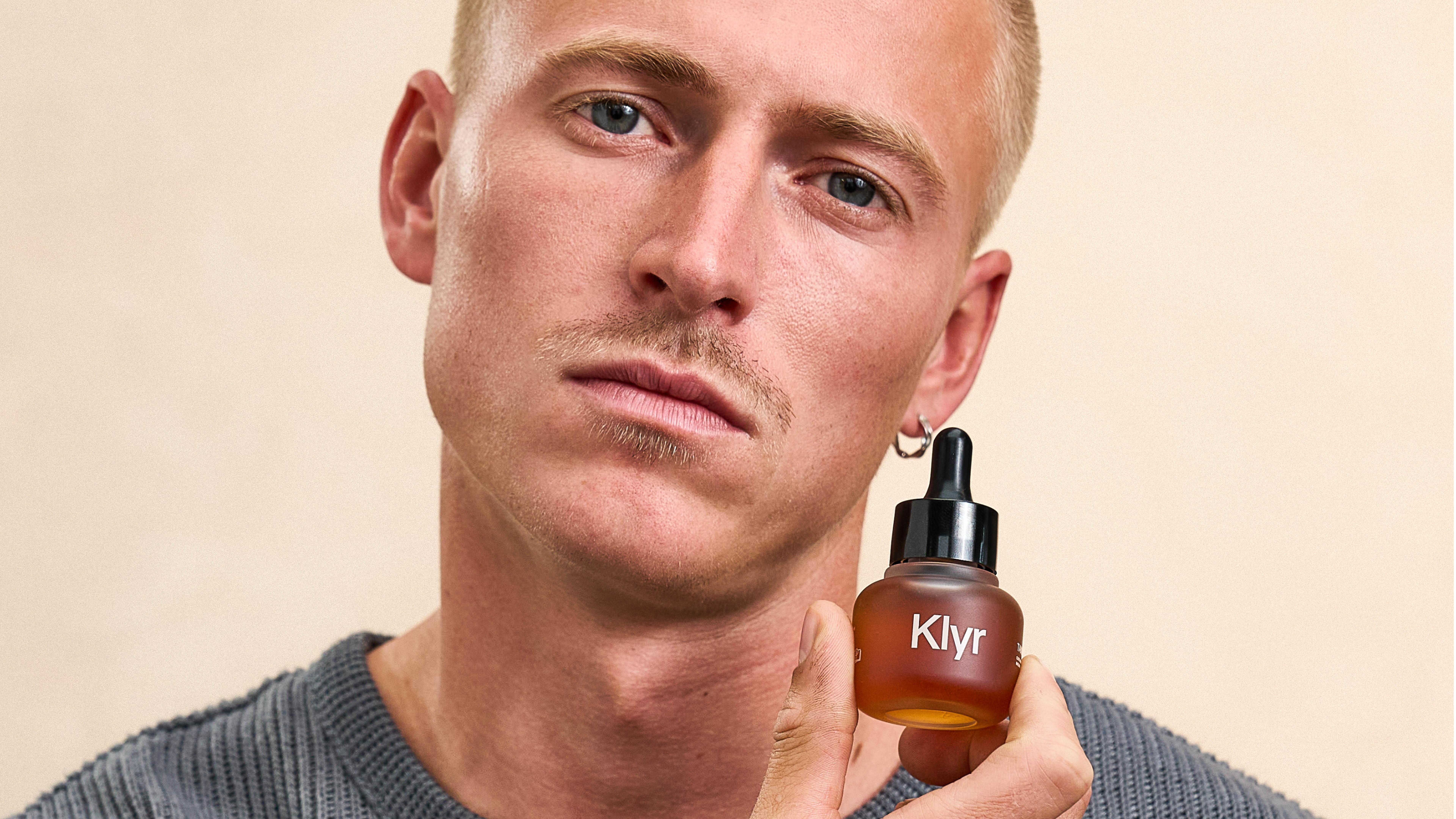
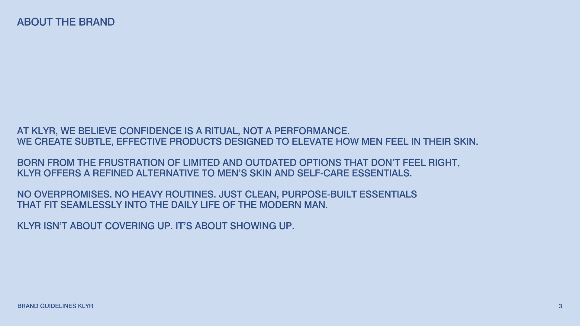
Klyr is a modern men's skincare brand built on quiet confidence. Formerly Alpha Skin, a name whose machismo no longer matched the audience, the brand was renamed, repositioned, and redesigned from the ground up in six weeks: strategy, identity, packaging, and a visual system built to scale across an expanding product range.


The challenge
Klyr started life as Alpha Skin, a name and identity that failed to match the brand’s actual audience. The Alpha label carried machismo connotations that did not reflect the brand’s vision. The goal was to move away from that stereotype, shifting the focus to confidence rather than macho, and breaking the stigma that cosmetics cannot be for men. While Alpha Skin had a unique proposition, with men's skincare created from scratch, its visual identity lacked character and alignment. It did not capture the refined, understated, and inclusive nature of the products, leaving the brand at risk of being lost among generic competitors.
The approach
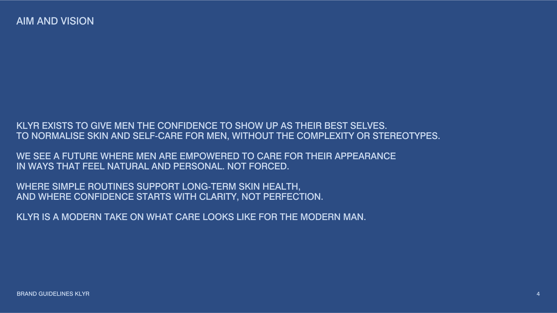
The process began with a strategic brand workshop involving the founder and investors, where we uncovered the deeper values and vision behind the business. Together we identified the need to step away from the machismo image and build a brand rooted in quiet confidence, to break the stigma around men using cosmetics, to create space for an expanded product range and audience shift, and to develop a consistent, refined visual system that could scale across all touch points. From this foundation, we committed to a full rebrand and rename, shaping a completely new strategic direction and visual identity.
The solution
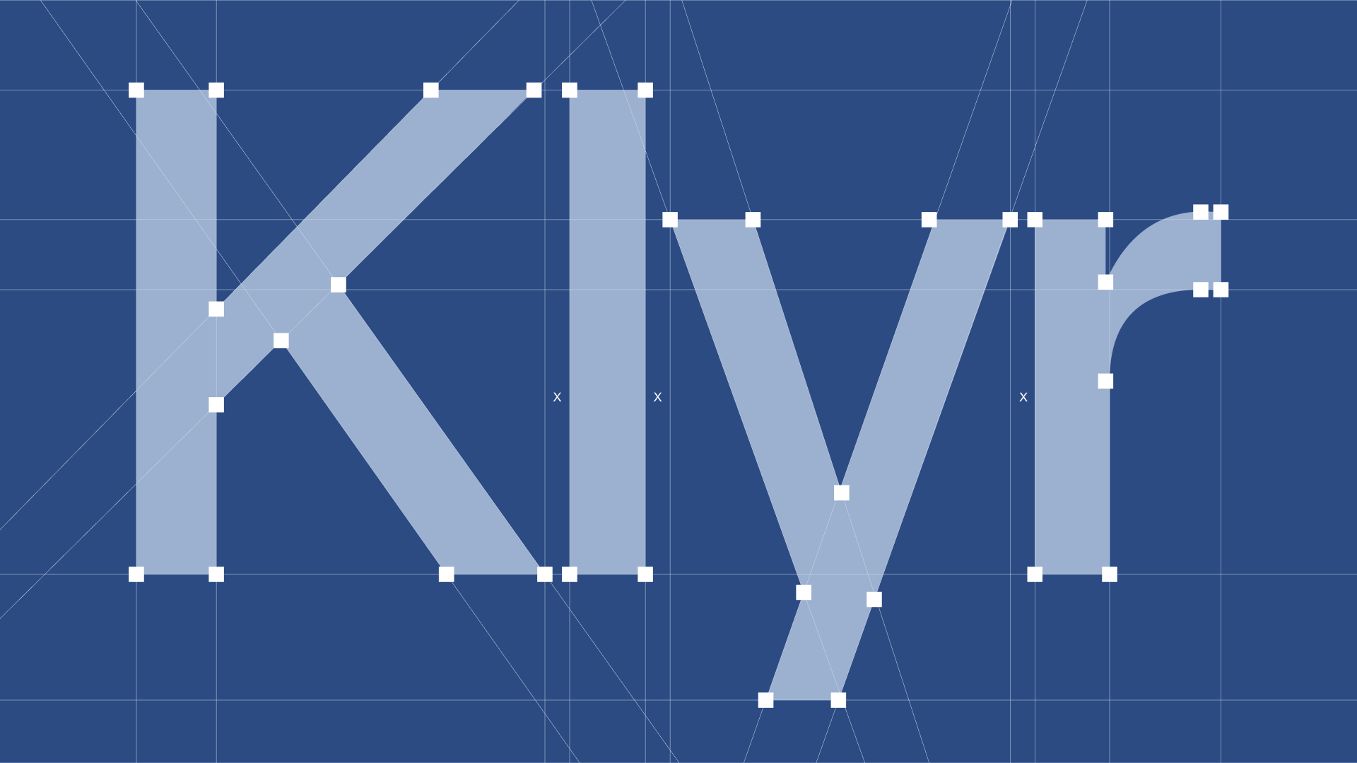
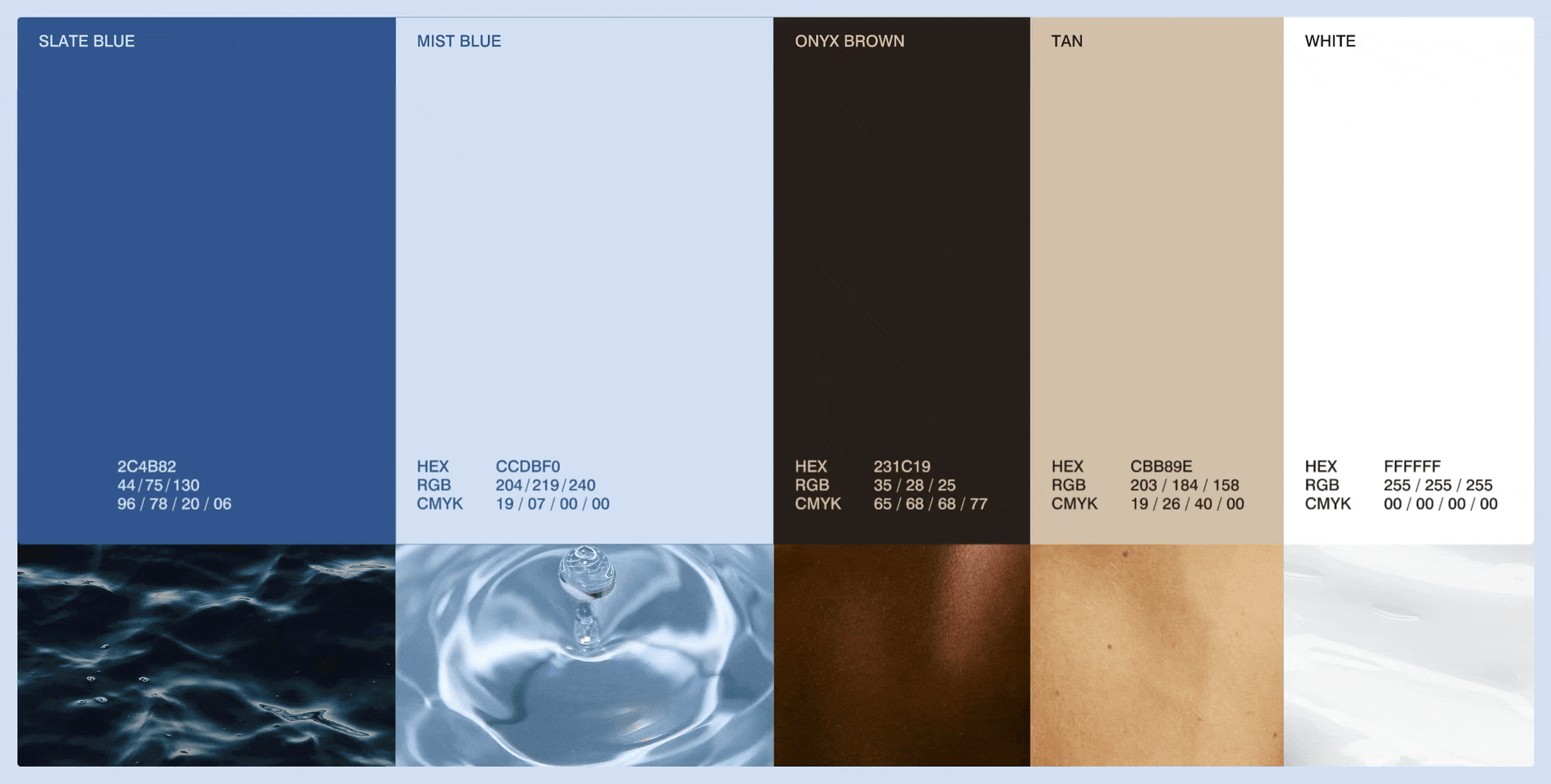
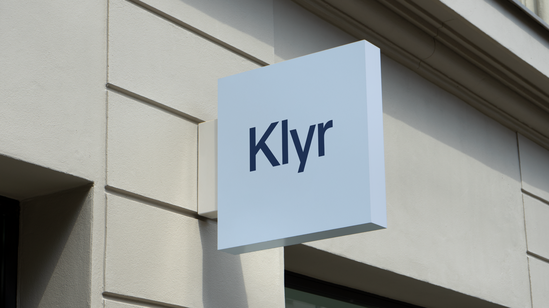
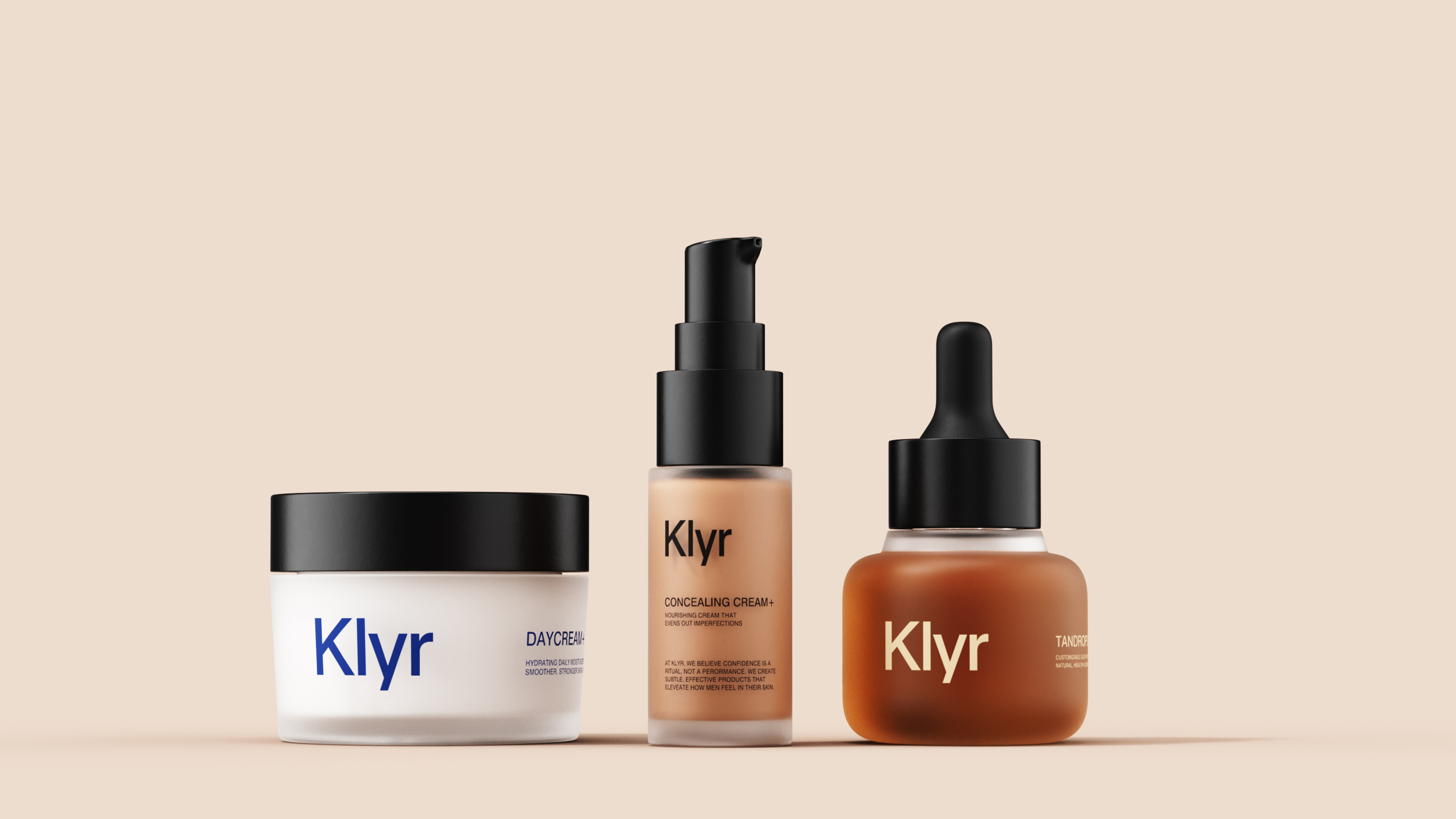
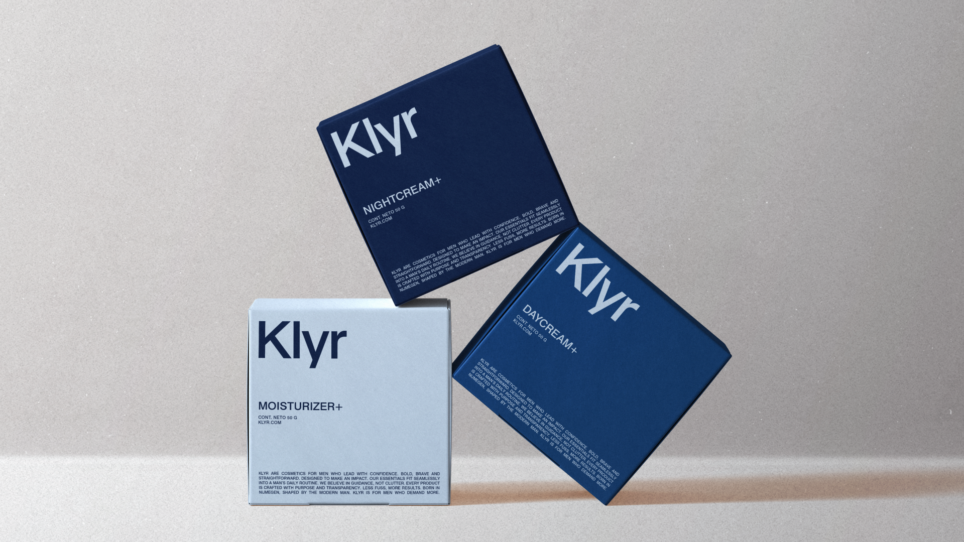
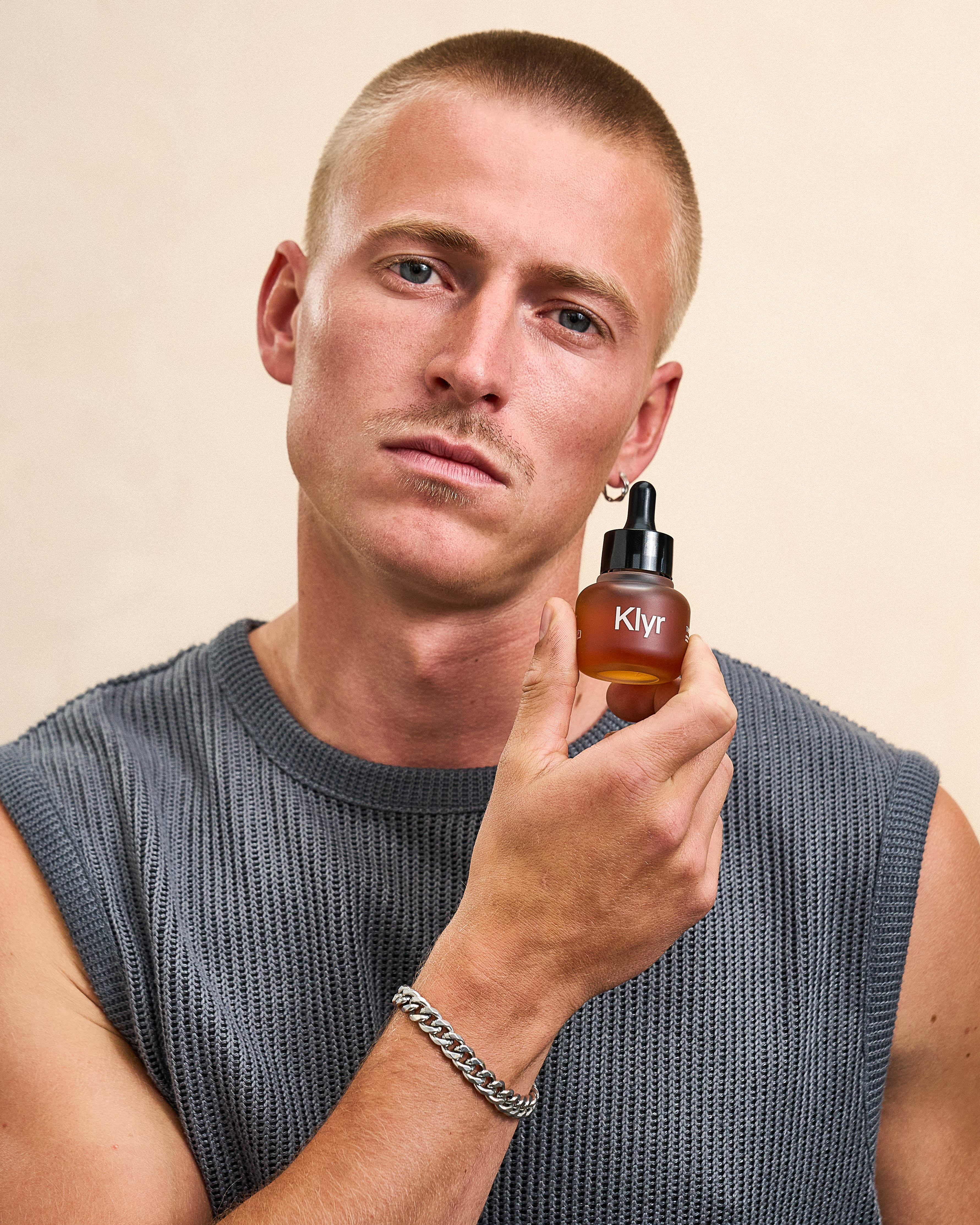
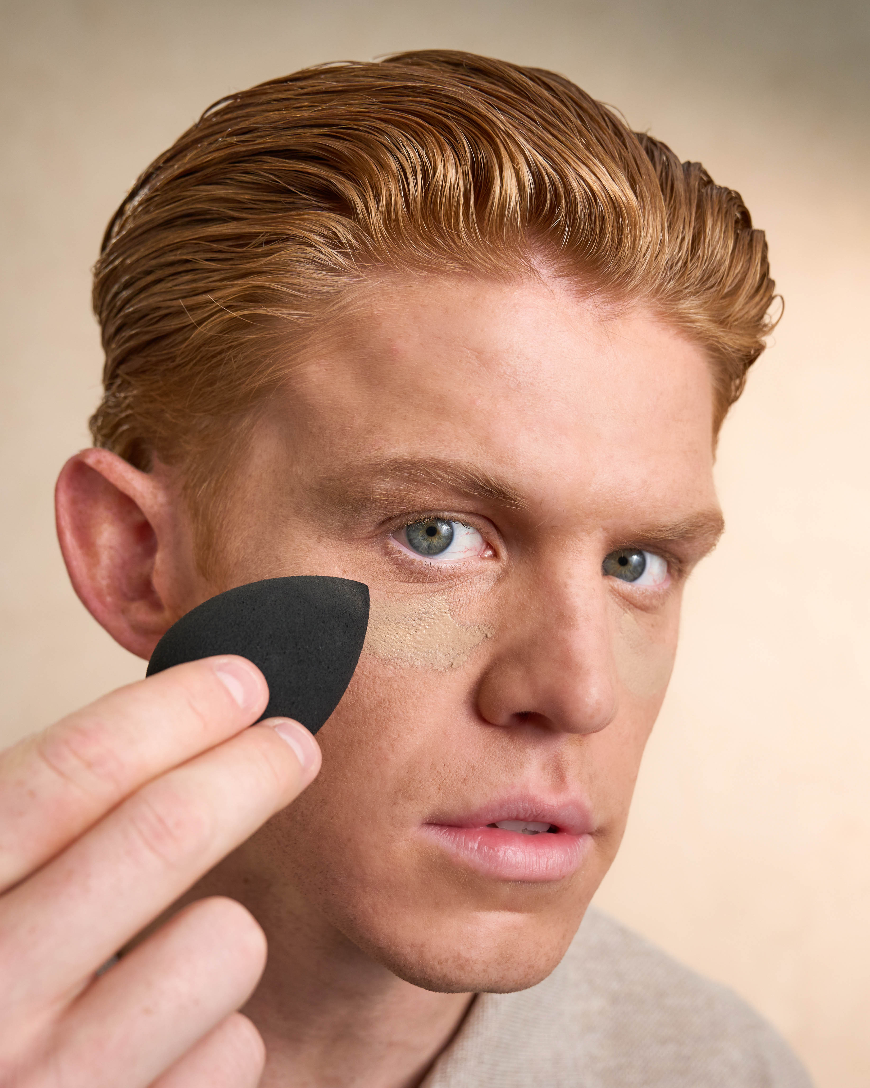
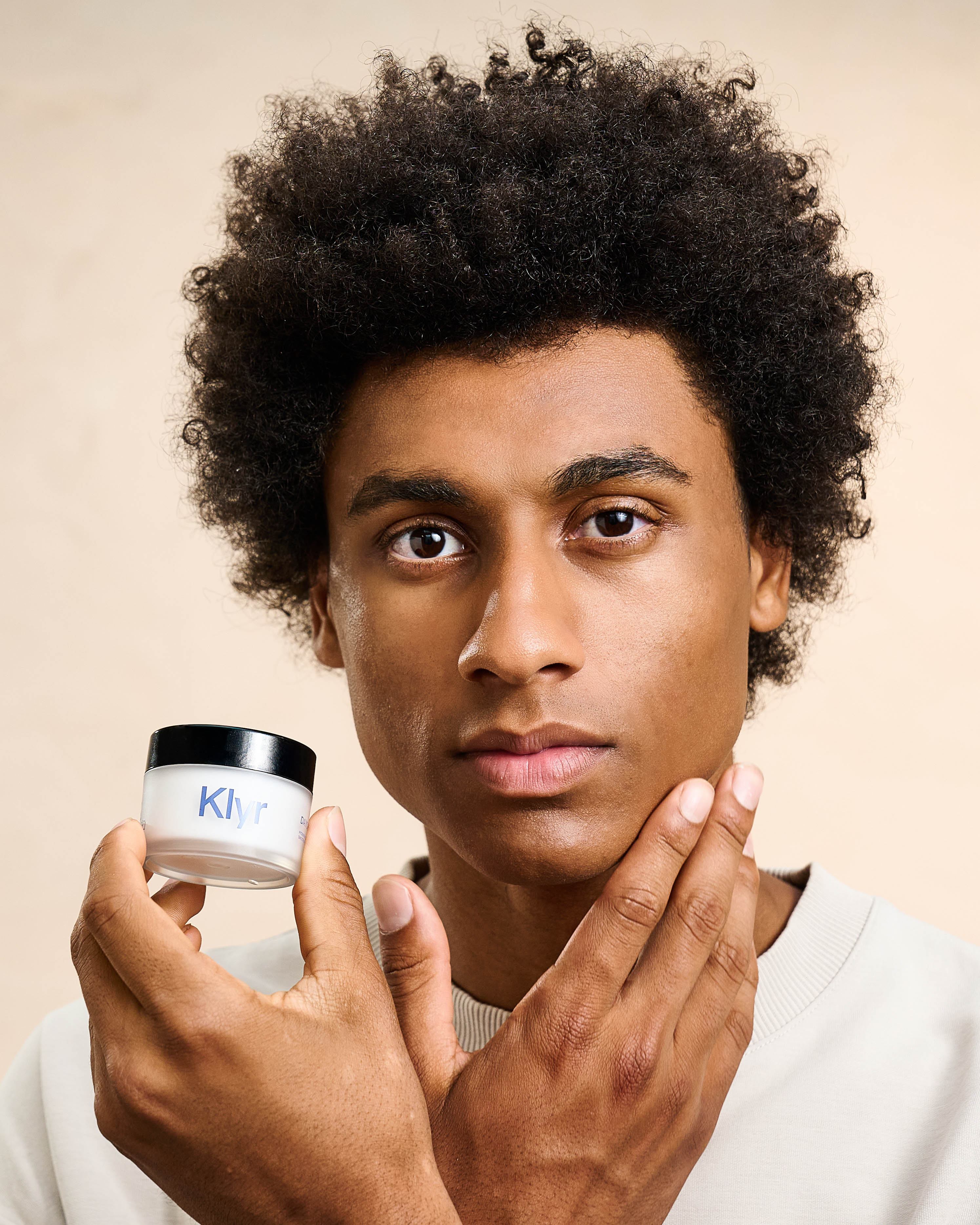
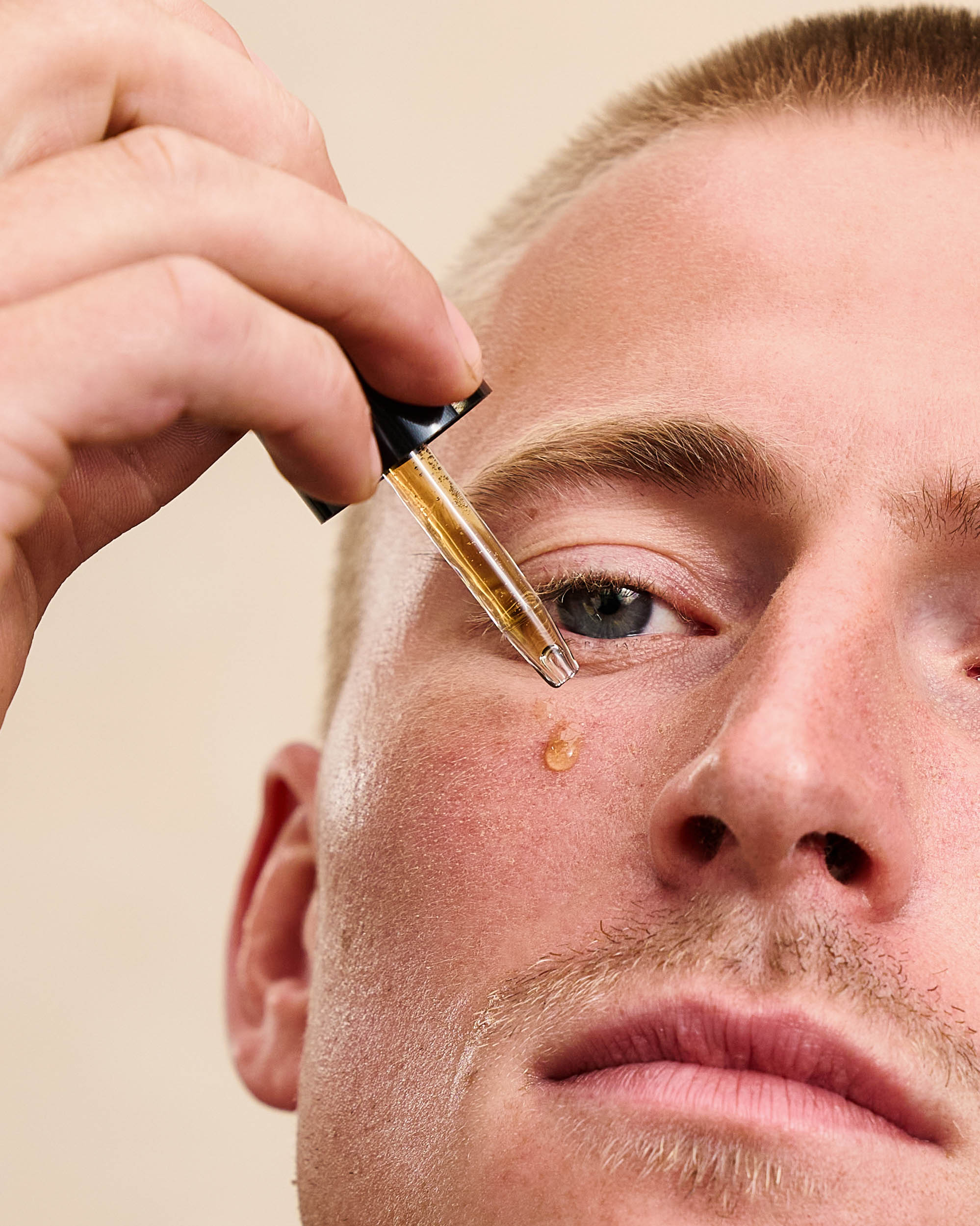
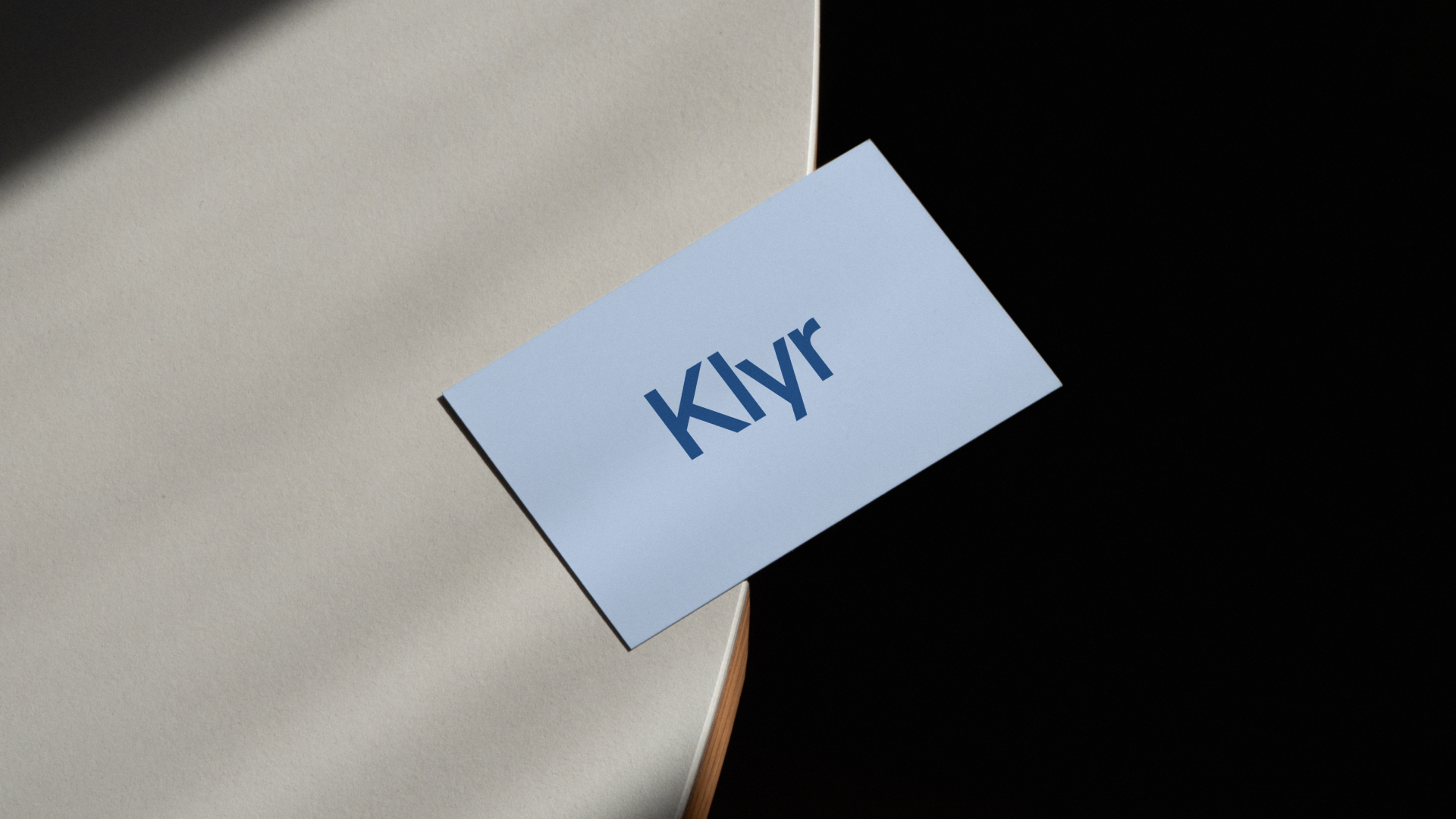
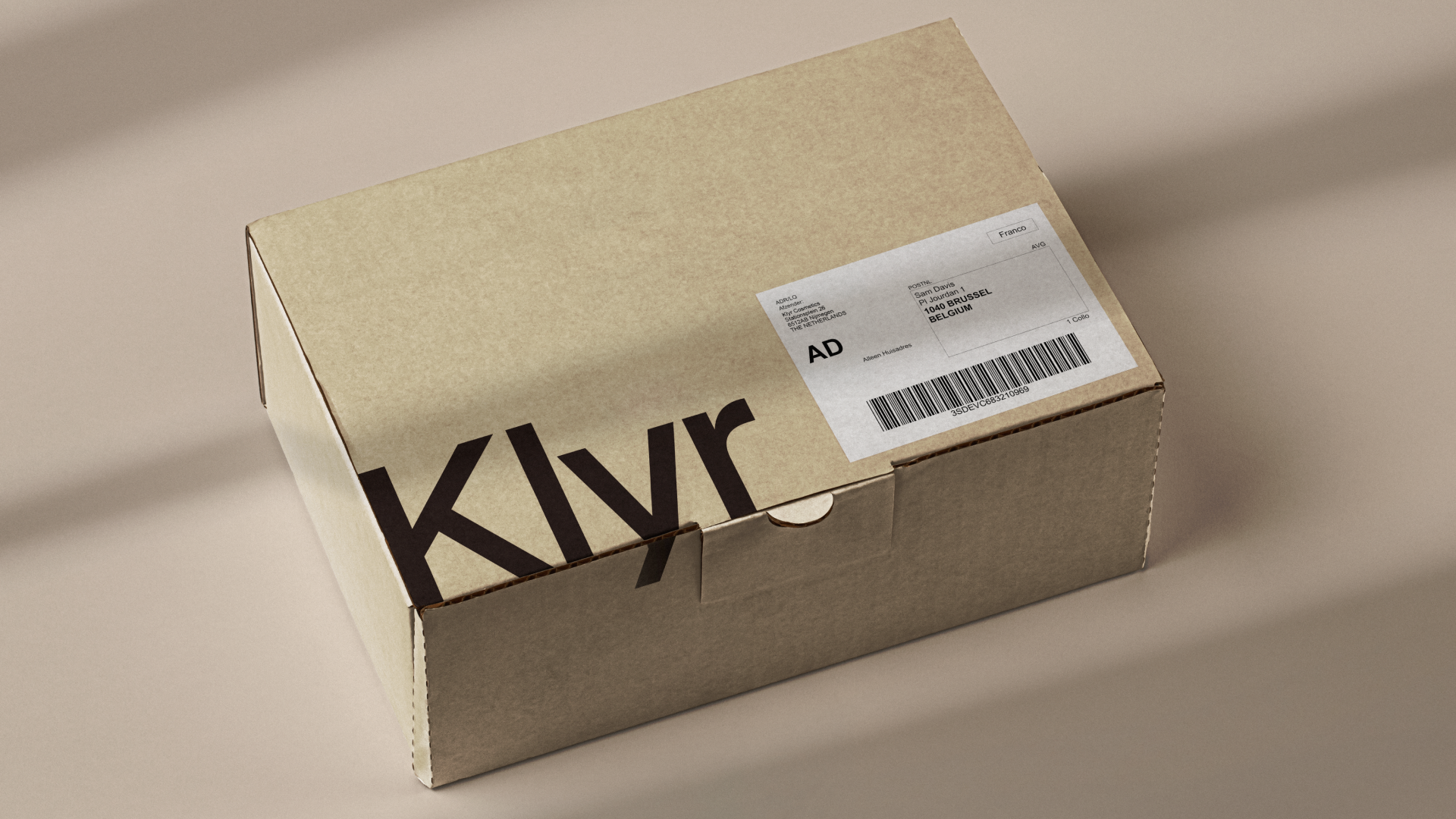
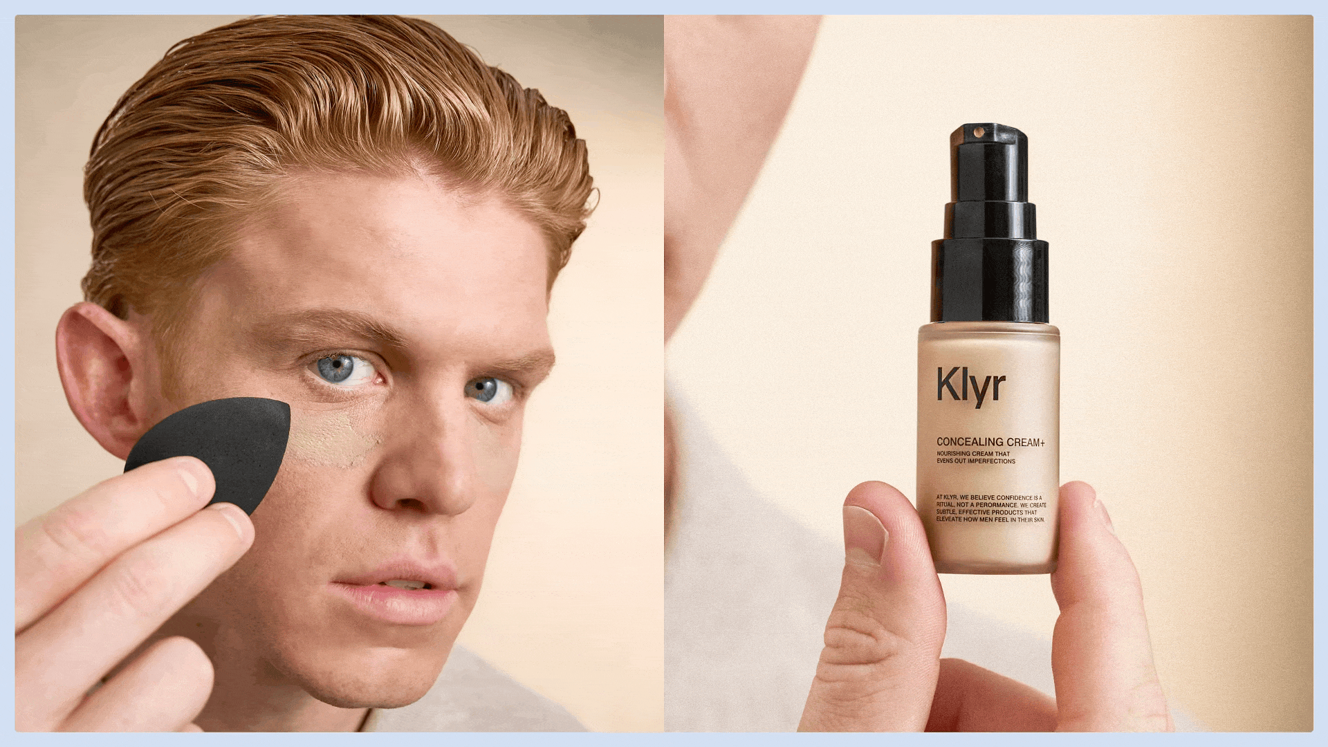
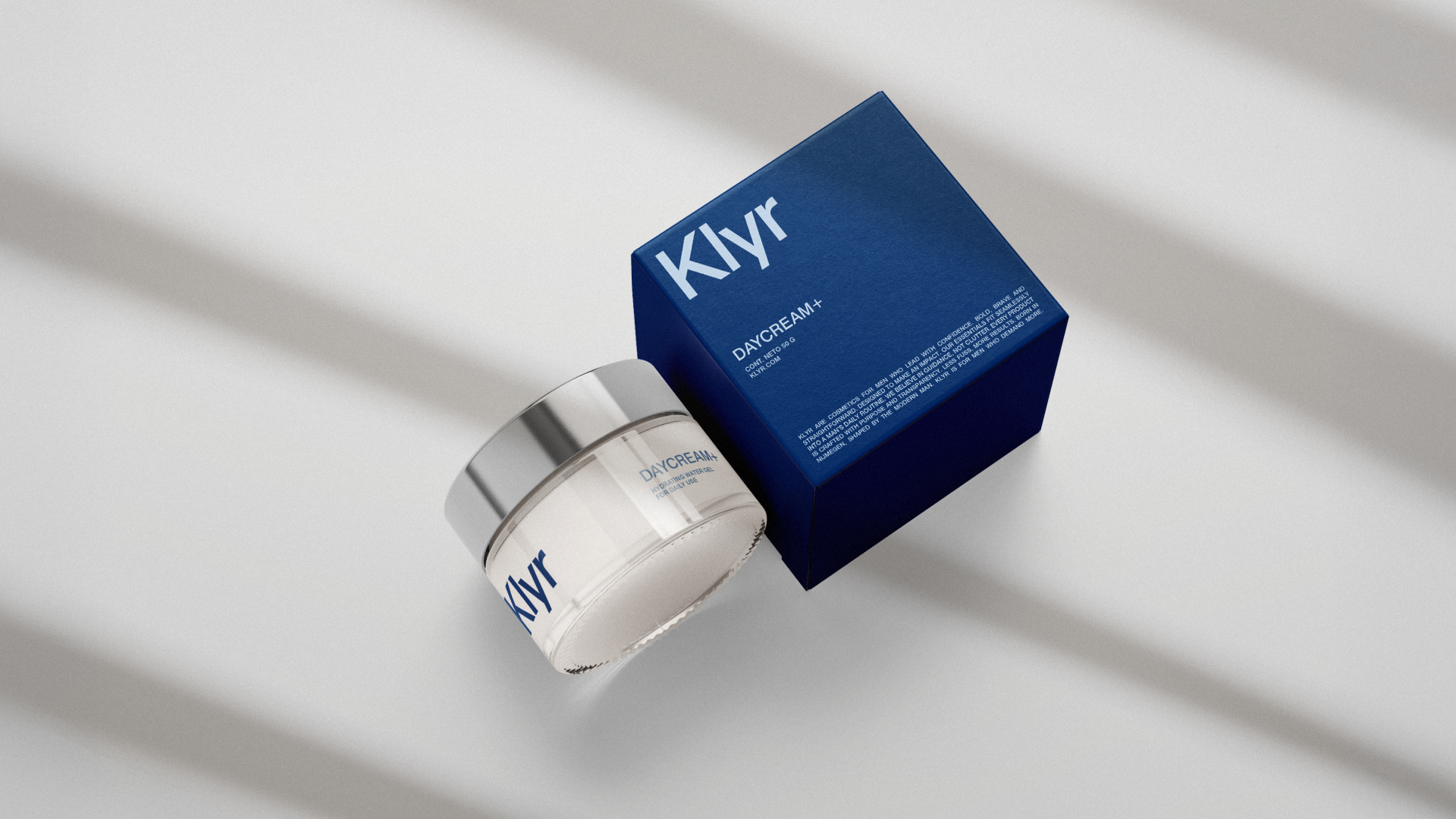
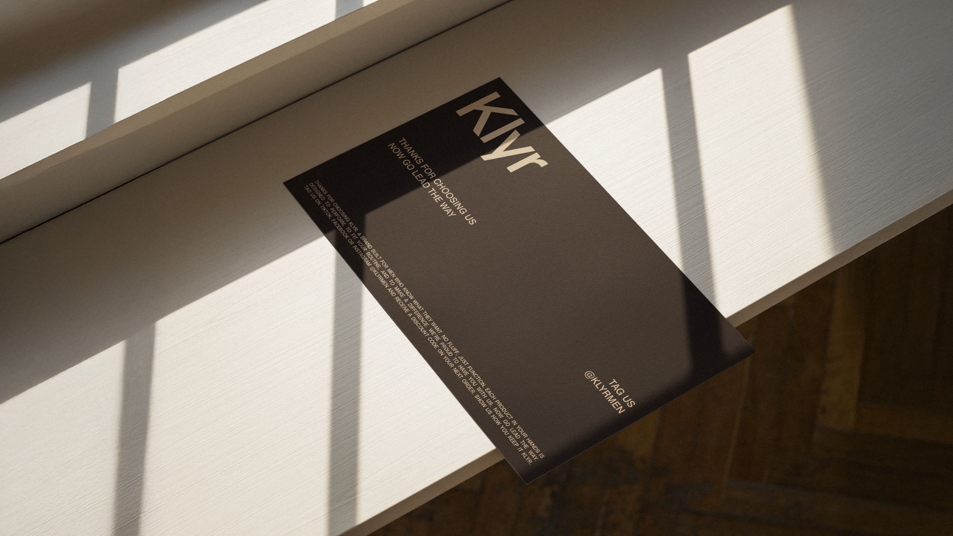
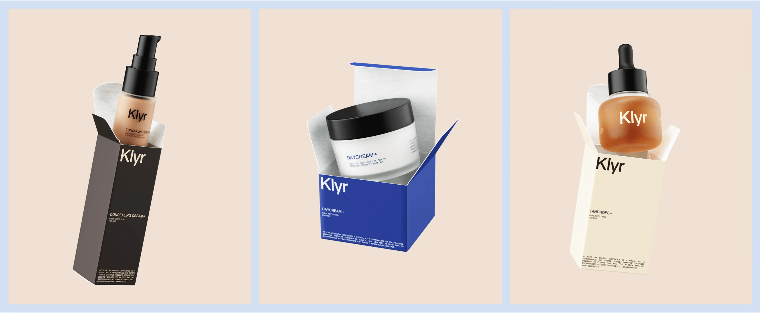
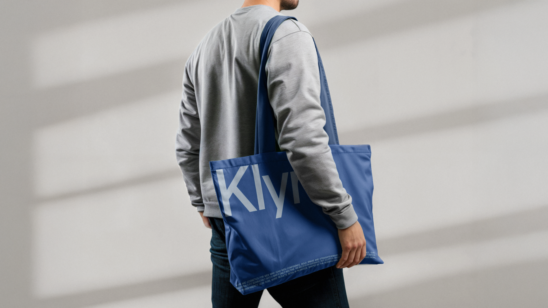
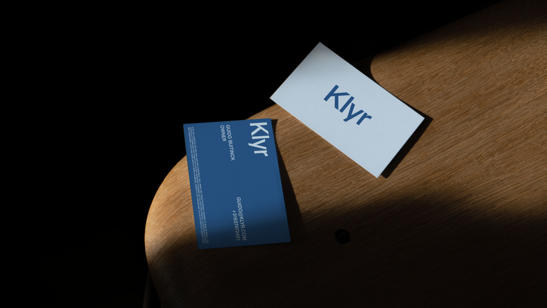
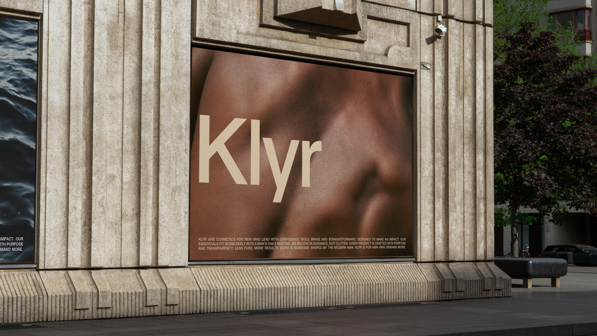
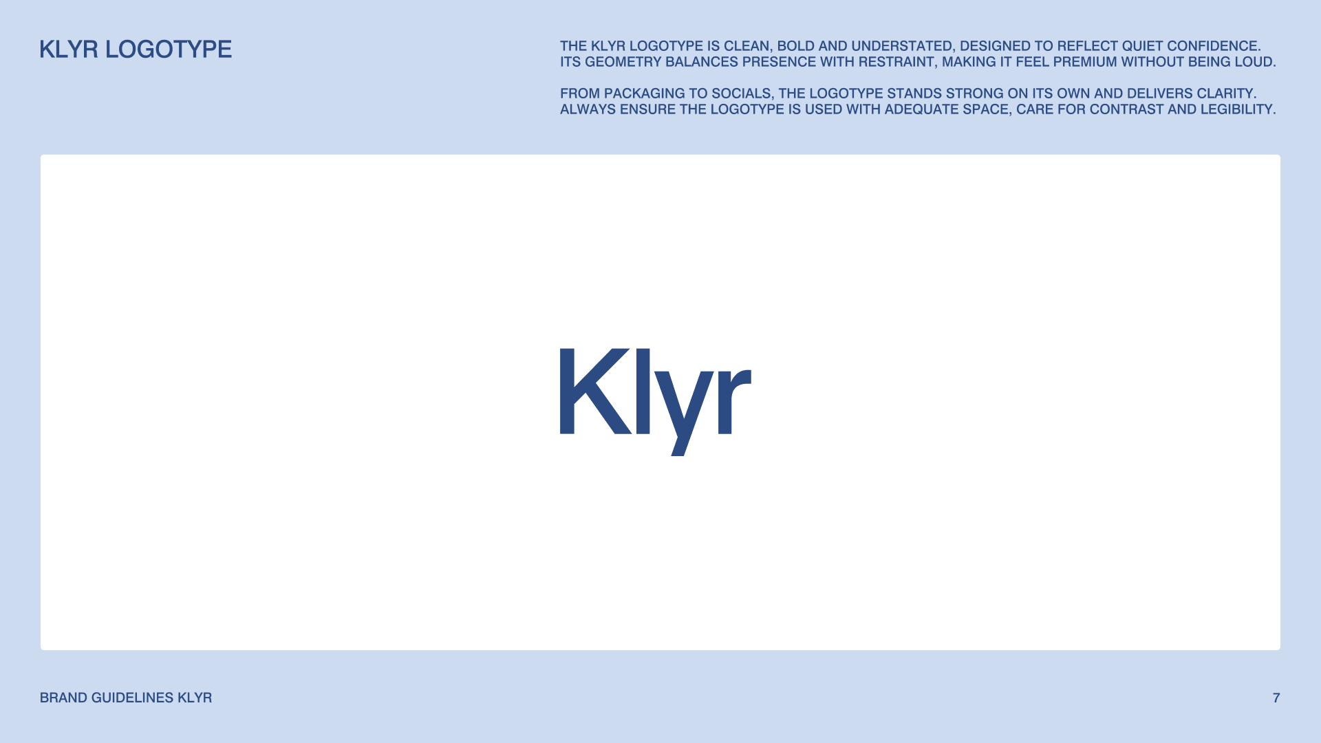
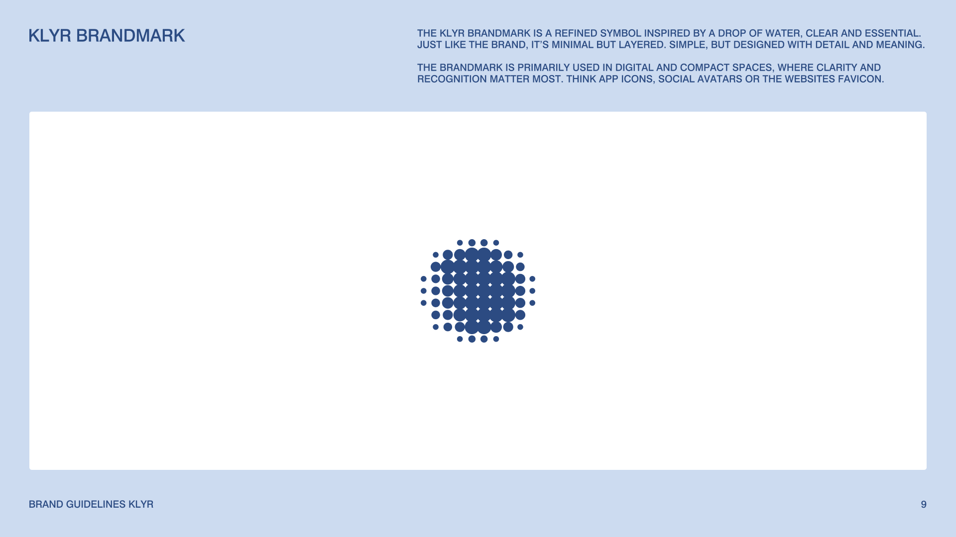
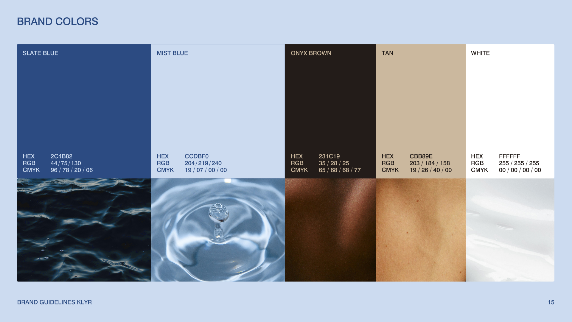
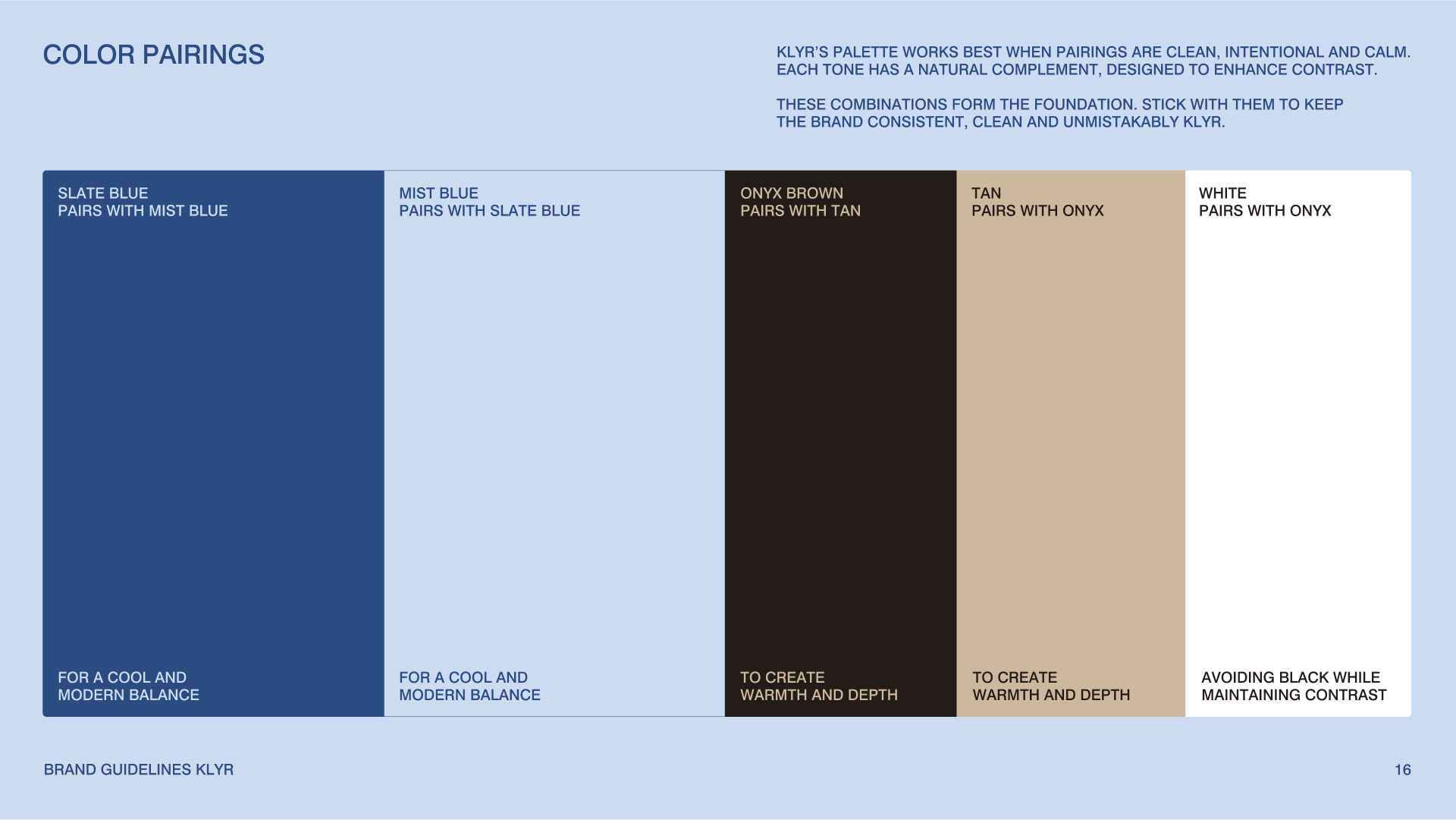
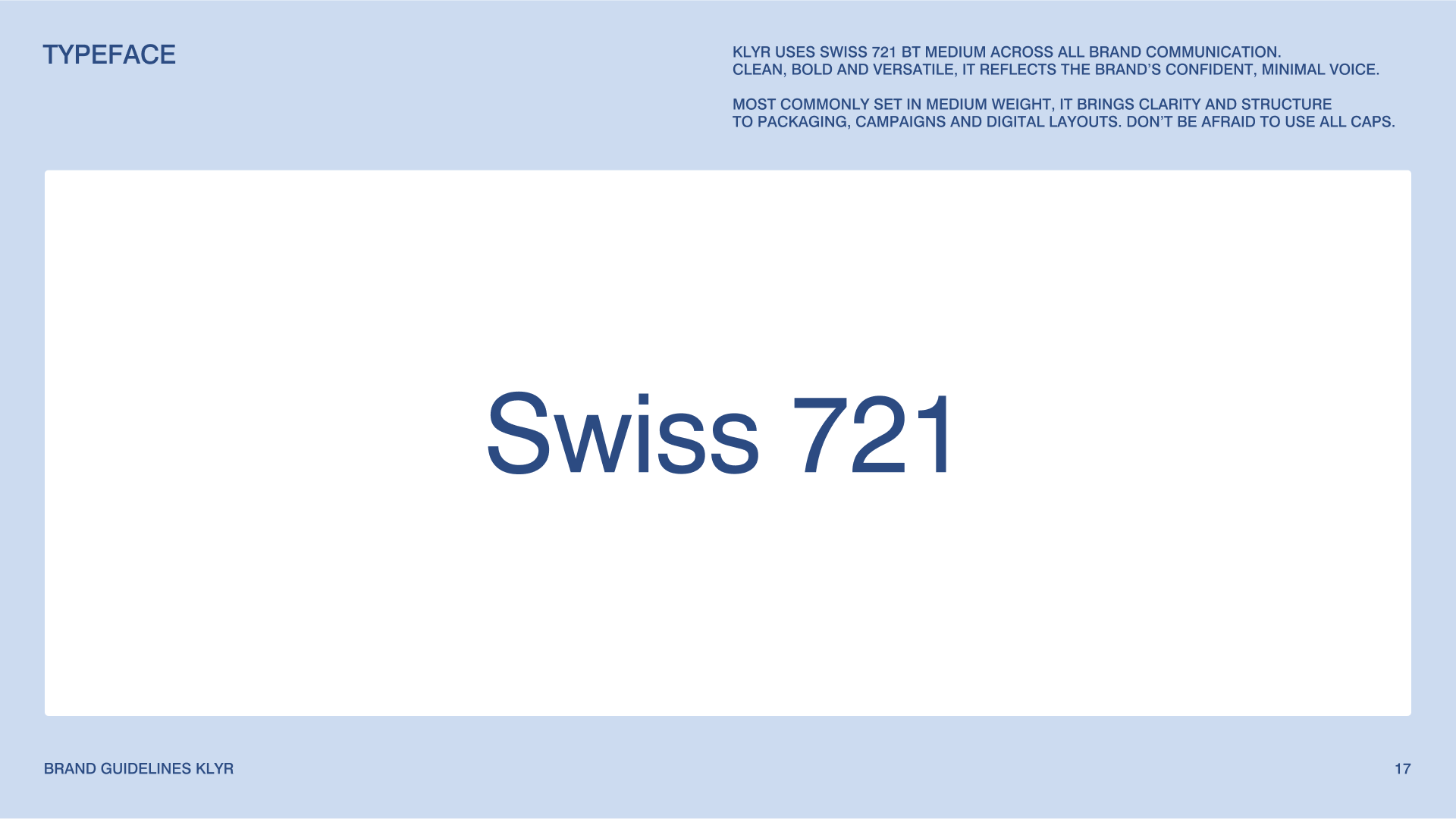
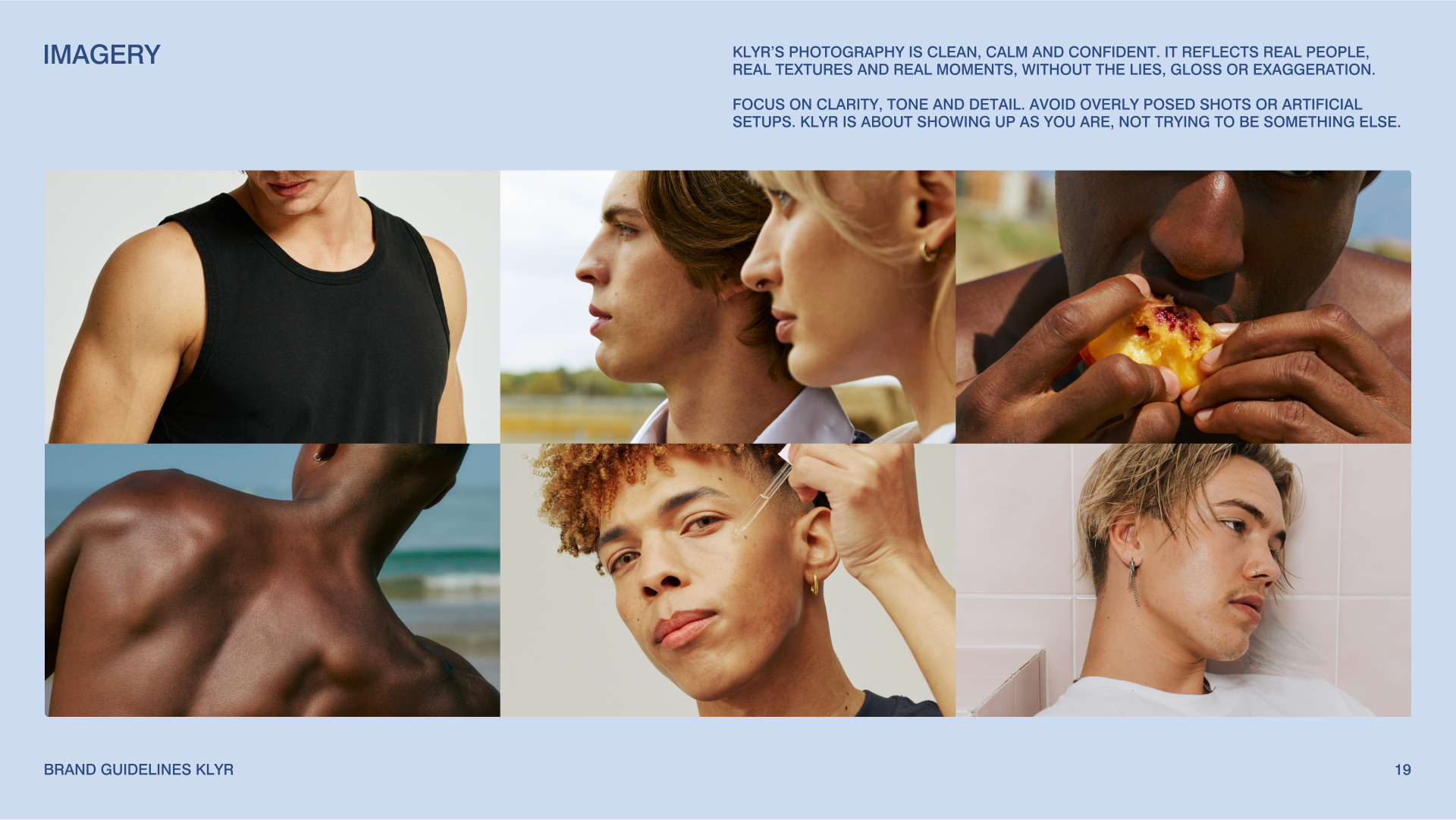
The result was Klyr, a name and brand that encapsulates clarity, refinement, and quiet strength. The new brand strategy was built around the idea of confidence as a ritual, not a performance. A complete naming process resulted in “Klyr,” short, memorable, and purposeful. The visual identity system features a bold, minimal logotype and a refined water-drop brandmark. A modern color palette was developed for warmth, depth, and versatility. The chosen typography brings clarity and structure. A new packaging system was created to balance premium appeal with everyday usability. The photography direction was defined to emphasise real textures, natural light, and understated confidence.This wasn't just a update, it was a complete repositioning to align with Klyr's true audience.
Impact
The transformation from Alpha Skin → Klyr changed everything. The product is now perceived as a refined, high-quality essential rather than a generic men’s cosmetic. The new identity resonates strongly with the target audience, breaking away from outdated stereotypes. Klyr’s updated packaging and visual system have been successfully implemented in its webshop and marketing channels. The founder reports a renewed sense of confidence in presenting the brand to partners and customers. Klyr now stands as a brand ready to grow, inspire loyalty, and lead the conversation in modern men’s self-care.

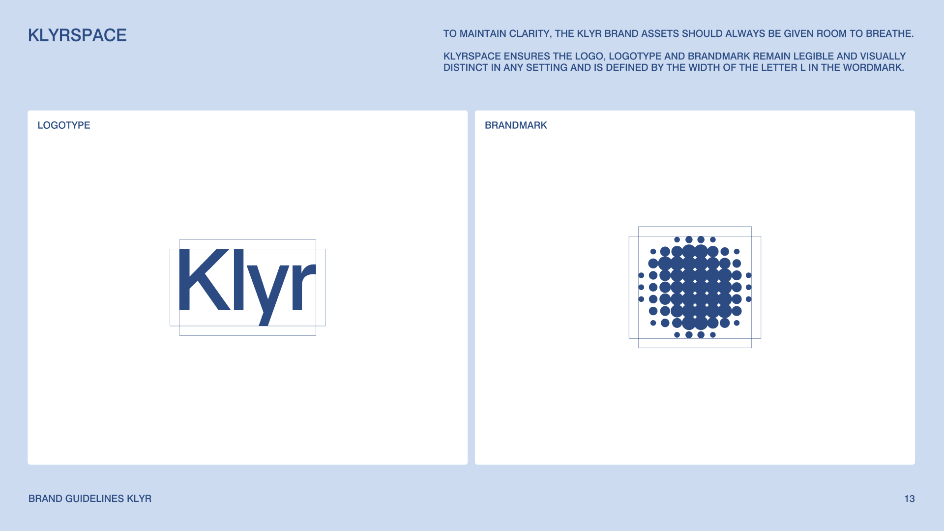
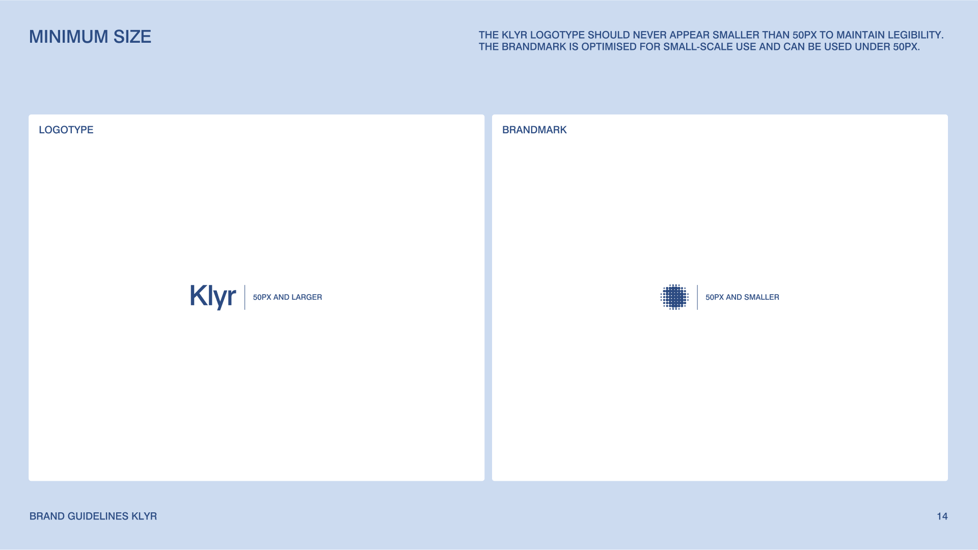
Design system and brand guidelines
For every Yvdh brand identity, we create an all-in-one actionable online brandbook including all strategy, creative direction, assets and guidelines. Well-defined brand guidelines outline the logo usage, colors, fonts, messaging and way more.
Credits
Creative Direction & Brand Design: Youri van den Hurk
Photography: Floris Christiaans
3D Design: Sam Ricken
Video: Videoexpress


Read how
Guido Buitinck
experienced our collaboration

From day one, Youri understood that Alpha Skin’s old identity did not match our audience. In one focused workshop he aligned everyone at the table and translated that into a clear brand strategy and an identity that finally fits who we are. The brandbook became our playbook. It made every decision faster and better. I designed the site for Klyr from the brandbook and even with an external developer the result looks like a professional build. Packaging is exactly as envisioned. Photography brings the mood to life. After launch we immediately saw orders coming in (including a single order worth €190), a 50% increase in conversion rate, and a wave of positive feedback. People finally see the brand we had in mind. Youri gave us a foundation we can scale on.


These scaleups raised €6M+
Rebrands
built to scale
Schedule a call and find out exactly what your brand needs for the next stage.