Oktober

Oktober is a young agency specialising in email and SMS marketing for fast-growing eCommerce brands. With a goal of helping ambitious entrepreneurs move away from ad reliance they offer strategies that create lasting customer connections.
This approach leads to repeat purchases and builds brand loyalty that paid ads alone can’t achieve. Oktober’s brand is a mix of playful energy and strong authority, combining deep industry knowledge with genuine connections.
The logo concept
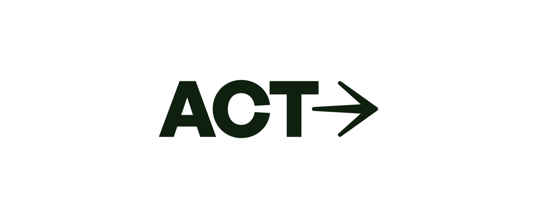
Oktober’s logo design focuses on a modern, bold wordmark that feels exclusive and energetic, matching the high-performing, 'outlaw' vibe of the brand. Designed to be sleek yet professional, the logo aligns with Oktober’s mission of empowering young, driven entrepreneurs with high-impact strategies.
The Oktober wordmark is writtten in a fully custom, bold sans-serif typeface, giving a strong, confident look that reflects Oktober’s no-nonsense approach to eCommerce marketing.


Design Elements
The color palette is a simple duotone palette with deep autumn and bright red hues, keeping the look clean and sharp while adding a subtle touch of seasonal warmth that aligns with the brand name.
Besides from the custom typeface used in it's wordmark, Futura Condensed is the main typeface for the Oktober brand, and is paired with the timelines helvetica font.
Overall, this gives Oktober a straightforward, exclusive style, focusing on brand recognition and making it's logo memorable across various mediums.

Imagery
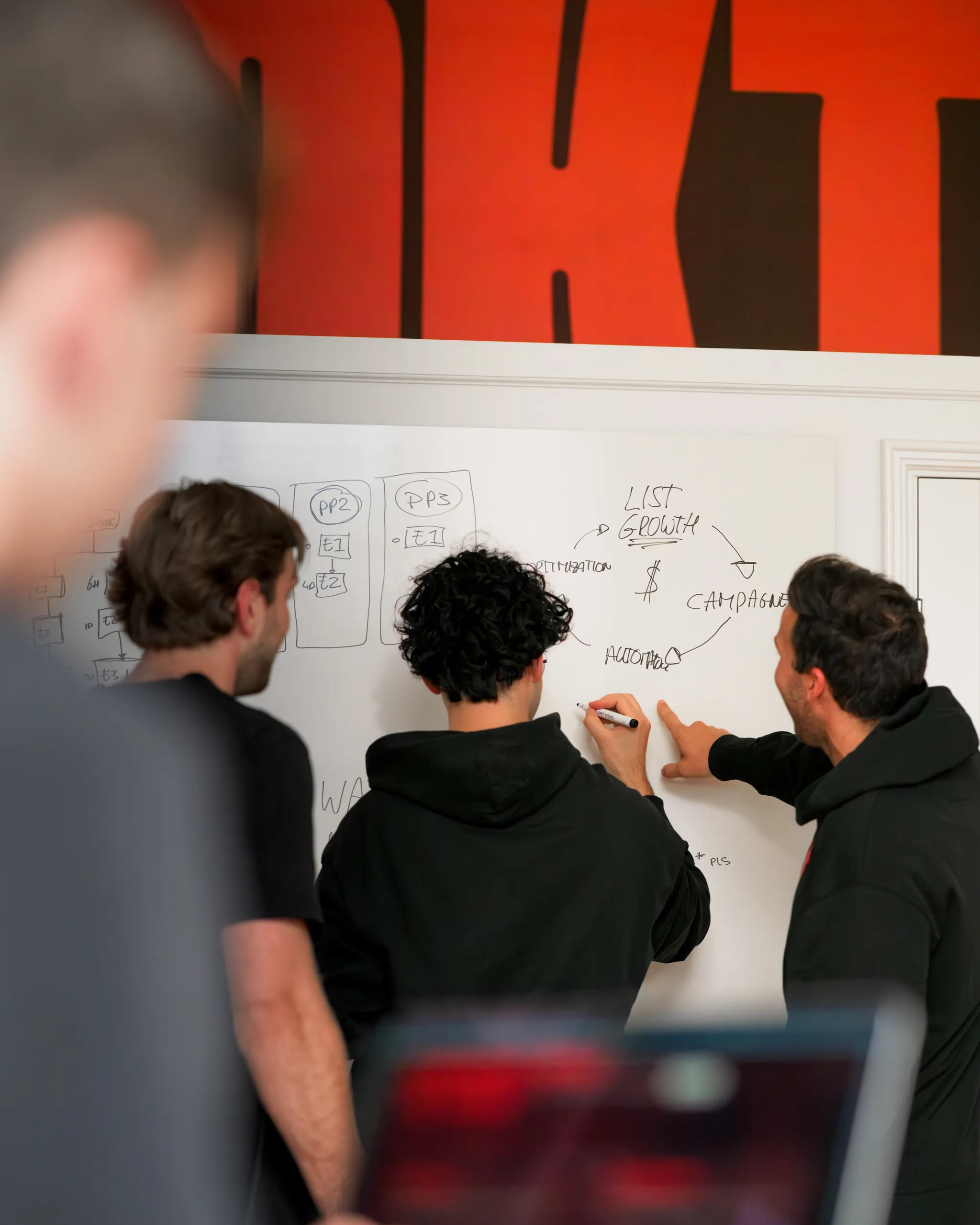
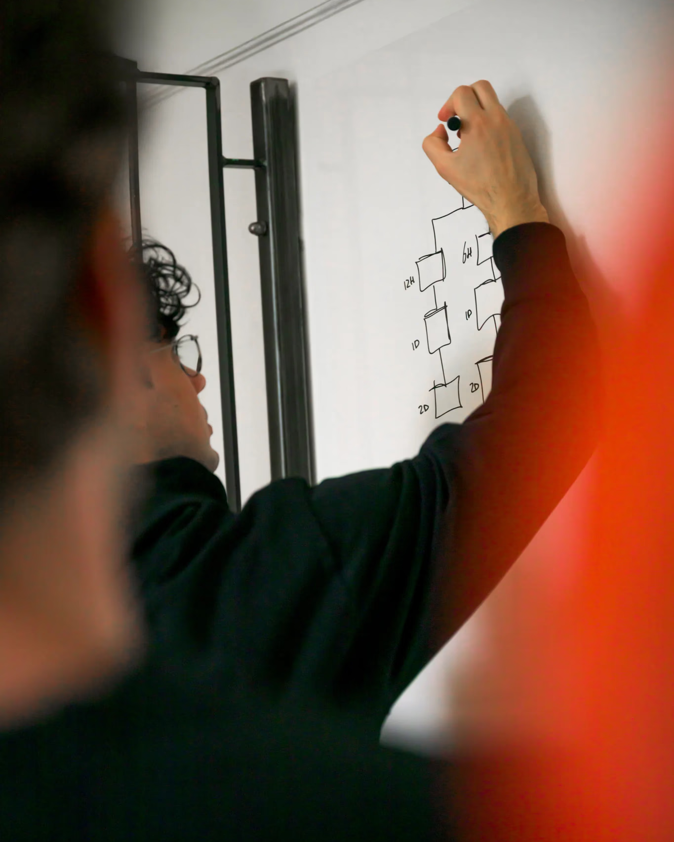
To bring Oktober’s brand personality to life, we defined a clear direction for imagery: authentic, modern, and subtly rebellious, just like the entrepreneurs Oktober works with.
The photography captures moments of focus, collaboration, and creativity in natural light, creating a sense of honesty and approachability while maintaining a sharp, professional edge.
Styling choices such as muted interiors, warm tones, and candid compositions reflect Oktober’s mix of playfulness and authority.
The result is an image library that feels personal yet premium, striking the balance between youthful energy and business confidence.
Full credit for the photography goes to Milan Goldbach, whose work translated the brand direction into a visual narrative that complements Oktober’s bold identity.


Result
The Oktober logo balances authority with a fresh, modern vibe. Its simple yet powerful design highlights Oktober’s position as a trusted partner for ambitious eCommerce brands looking to scale. This logo is crafted to stand out on both digital platforms and merchandise, creating an identity that is not only memorable but also ready for the brand’s future growth.


Read how
Rammin Azampanah
experienced our collaboration


These scaleups raised €6M+
Rebrands

built to scale
Schedule a call and find out exactly what your brand needs for the next stage.